This guide will assist you in crafting a visually striking, user-friendly, and professional website that effectively communicates your business’s mission and services.
1. Utilize white or open space effectively for a neat and organized design
White space, also referred to as negative space, is the unoccupied space surrounding elements on your website, such as text and images. It’s crucial for crafting a neat, organized, and readable design.
A good practice would be to ensure sufficient margins between paragraphs, images, and other content. Instead of packing everything closely, use white space to give your content room to breathe. This makes it easier for users to scan and comprehend the information on your site.
Keep in mind that white or open negative space doesn’t necessarily have to be white; it can be any background color that contrasts well with your text and images. By effectively utilizing white space, you can direct your users’ attention to the most crucial elements on your page.
2. Employ visual hierarchy to guide the user’s attention to important elements
Visual hierarchy is the arrangement of elements on a web page in a way that highlights their importance. This can be achieved using size, color, contrast, and typography.
For instance, you might use a larger font size for your main heading and smaller font sizes for subheadings.
Here’s an example below in the blue box. You see the big things, first, and the middle things next and the small things last.
Here’s an example of visual hierarchy :
Discover All About Web Design On This Page
Useful advice and strategies for non-designers and business owners
This article will greatly assist you in understanding what you need to know as you collaborate with a web designer before you launch your website.
This helps users quickly comprehend the structure of your content and where to find the information they’re seeking.
Another way to create visual hierarchy is by using bold ( tag) or italic text to emphasize important points within paragraphs. By making certain words or phrases stand out, you can guide the user’s attention and help them quickly grasp your message.
3. Implement a grid system for a consistent layout and organization of content
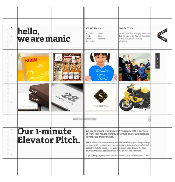
A grid system is a set of guidelines for organizing your website’s content into columns and rows, which helps create a consistent, professional-looking layout.
Grid systems can be as simple or as complex as you’d like, but the key is to maintain a consistent structure throughout your site.
An example of this would be using a 12-column grid, which allows you to divide your content into even sections for easy readability and organization.
Here are some grid-based layouts:
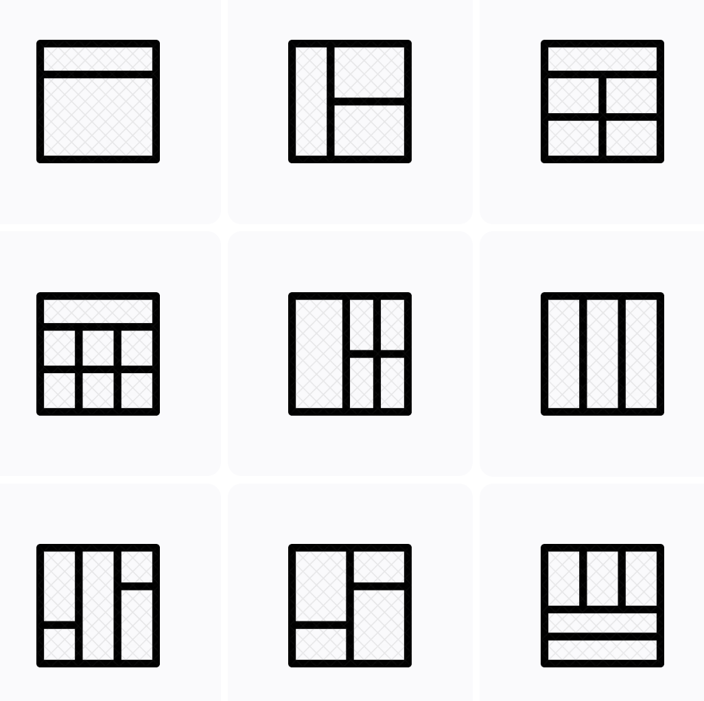
By using a grid system, you ensure that elements on your site are aligned, and it becomes easier to create a responsive design that looks great on all devices. If you have a grid in place, it will make your site look more polished and well-organized, which is crucial for making a great first impression on potential customers.
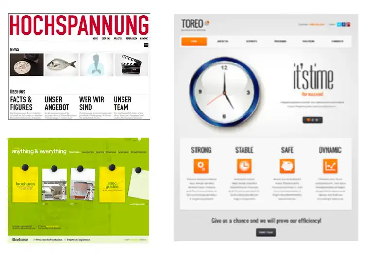
4. Your page layout should be balanced, and not overly “busy” with elements
A balanced page layout is one that has an equal distribution of visual “weight” on both the left and right sides of the page. This can be achieved by considering the size, color, and position of elements on your site. An example of this would be placing a large image on the left side of the page and balancing it with equally sized text on the right side.
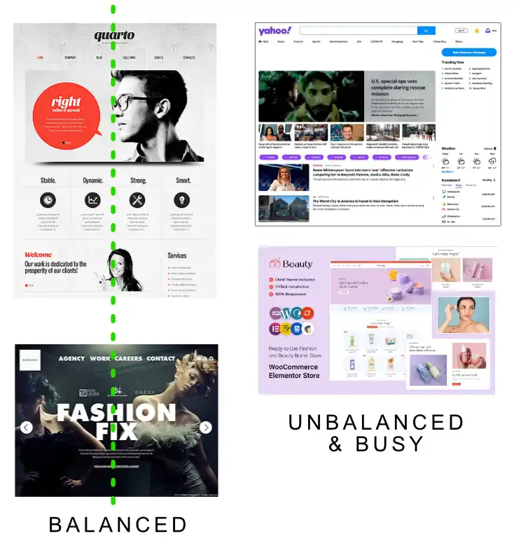
A balanced layout is visually pleasing and easier to navigate – and it’s what users have come to expect online from professional companies they see every day.
Sites that are overly busy visually are hard for the user because they don’t know where to look, or what to consider important. Less is often more.
Balanced and unbusy layouts help guide the user’s eye through your content in a natural, organized way, making it more likely they’ll engage with your site and understand your message.
5. Use a clear and concise main heading, and subheading copy to communicate your message effectively.
A user should be able to intuitively understand what you offer in 1-2 seconds
Your main heading and subheadings are crucial for quickly conveying your message to users. They should be clear, concise, and to the point, allowing users to understand your offerings within just a few seconds.
![]()
![]() For example, having a main heading like “Affordable Web Design Services” and a subheading like “Customized Solutions for Your Business Needs.” These headings provide users with a clear idea of what you do and how you can help them.
For example, having a main heading like “Affordable Web Design Services” and a subheading like “Customized Solutions for Your Business Needs.” These headings provide users with a clear idea of what you do and how you can help them.
By having a strong and easily understood main heading and subheadings, you help users quickly grasp the purpose of your site, increasing the chances they will engage with your content and become potential customers.
6. Your logo should be clean, easy to read, limited colors, and professional looking
Your logo is a visual representation of your brand and often the first thing users see when they visit your website. A clean, easy-to-read logo with limited colors and a professional look is essential for creating a positive first impression.

A logo with a simple icon or stylized text and a color palette of two to three complementary colors will be easier to read, and more clean and professional looking to your user.
A well-designed logo not only looks appealing but also helps build trust and credibility, as it demonstrates that your business takes its image and professionalism seriously. Keep in mind that your logo should also be easily recognizable and scalable, so it looks good on different devices and screen sizes.
7. Minimize text. Remember: people scan. They don’t read unless they have to, or have high interest.
Paragraphs on your homepage should be very short or non-existent. The longer paragraphs are for inner pages, or lower down on your homepage normally
When users visit your website, they typically scan the content rather than reading every word. To cater to this behavior, keep paragraphs on your homepage short and concise. An example of this would be using bullet points or short sentences to convey key information quickly and efficiently.
Longer paragraphs should be reserved for inner pages or further down your homepage, where users are more likely to be interested in reading detailed information.
By structuring your content this way, you make it easier for users to find and process the information they need, improving their overall experience on your site.
8. Use effective calls to action.
Tell your visitors what you want them to do, whether it’s to sign up for your newsletter, contact you, or make a purchase
Calls to action (CTAs) are prompts that encourage users to take a specific action on your website, such as signing up for a newsletter, contacting you, or making a purchase.
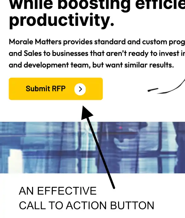
Effective CTAs should be clear, concise, and prominently placed on your site. For example, a bold “Sign Up Now” button placed near the top of your homepage or a “Contact Us” link in your site’s navigation menu.
By providing users with clear guidance on what action you’d like them to take, you increase the chances they will engage with your site and ultimately convert into customers or clients.