Why a Good Website Design Matters and How to Achieve It
In the current digital era, owning a website is crucial for any individual or business to establish an online presence. However, merely having a website isn’t sufficient; the design of the website is a key determinant of its success. A well-crafted website can attract and retain visitors, enhance brand recognition, and ultimately lead to increased conversions.
Building a business website doesn’t have to be intimidating. Here are some steps to guide you:
- Determine the purpose of your website (selling products, providing information, or both) to guide its design and functionality.
- Select a website builder like Wix or Squarespace or engage a web designer for a custom site.
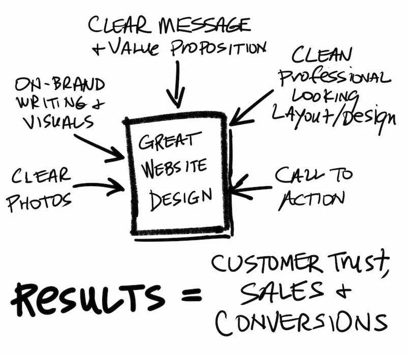
- Ensure the website is visually appealing and easy to navigate with high-quality images and clear language.
- Optimize for search engines with relevant keywords, quality content, and backlinks to increase visibility and attract customers.
- Ensure it’s mobile-friendly as many people access the internet on their phones.
Key Elements of a Great Website Design
A great website isn’t just about aesthetics; it’s about effectively combining these elements:
- excellent user experience (UX)
- visual design
- loading speed
- mobile responsiveness
- accessibility
- branding (visual and writing tone)
- content strategy
When you optimize all these factors, you’ll have a truly successful website that’s visually appealing and easy to use.
Your website should also align with your brand’s personality and goals while meeting users’ needs. To strike this balance, you need to consider everything from fonts and colors to engaging content that connects with your audience.
So, how do you find this perfect balance? Let’s delve into each aspect of effective web design to help you create a winning formula for success!
User Experience (UX)
The user experience (UX) is a vital component of website design. A website’s UX plays a crucial role in determining whether or not visitors will stay on the site or quickly leave.
When the user can easily navigate and interact with the website, they are more likely to have a positive experience and spend more time on the site. In addition, high-quality UX leads to increased engagement, which results in higher conversions, lower bounce rates, and repeat visitors.
The Role of UX in Website Design
When it comes to designing websites, user experience should be central to every decision made. Creating an effective UX means putting yourself in your visitor’s shoes and anticipating their needs and wants as they navigate your website.
Understanding what users expect from your site is essential so that you can provide them with a seamless experience that is easy to use, visually appealing, and meets their needs. Keep in mind that good UX improves customer loyalty by building trust between your business and its customers.
If users don’t feel your website design is professional enough – they won’t trust your business
This is a critical point: People are more likely to purchase from a site they feel they can trust and recommend sites that provide them with an excellent user experience.
Take time to ensure each element of your website design is optimized for usability: intuitive navigation menus, consistent formatting throughout pages, clear calls-to-action (CTAs), quick load times for images/videos/other media elements – all contribute towards better user experiences.
Guidelines for Enhancing UX
Creating great UX involves numerous considerations; however having some general tips handy certainly helps!
- Maintain Simple Navigation: Users should be able to find what they’re looking for quickly without getting lost or overwhelmed by too much information.
- Clear & Consistent CTAs: Clearly defined CTAs help guide users through different areas of your site; make sure they stand out enough from surrounding content.
- Responsiveness & Speed: Ensure quick loading speeds across all devices as well as mobile responsiveness so that more users can access your site from anywhere and at any time.
- Design for Accessibility: Create designs with people of all abilities in mind.
- Test and Iterate: Always test the UX of your website design with real users to get feedback on what works best.
Iterate based on your findings to improve the experience over time. By keeping these tips in mind while designing websites, you can ensure that you’re creating an excellent user experience that will keep visitors engaged, satisfied, and coming back for more.
Visual Design
While user experience is crucial, visual design is what initially catches a visitor’s eye and keeps them engaged with your website. A visually appealing design can help establish credibility and trust with your audience.
It’s important to consider color, typography, imagery, and overall layout when creating a website design that stands out.
Design and Layout Hierarchy
When it comes to web design and layout, creating a clear and effective hierarchy is paramount. This isn’t just about aesthetics – it’s about creating an intuitive and seamless user experience. One of the best ways to establish this hierarchy is through the strategic use of H1, H2, and H3 subheadings.
The Function of H1, H2, and H3 Subheadings
The H1 tag is the most important and should be used for the main title of your page – think of it as the headline of a newspaper article. This not only catches the user’s eye but also informs search engines about the primary topic of your page.
Next come the H2 tags. These serve as subheadings to the H1 title and are perfect for breaking down your content into digestible chunks. H2 tags often cover different aspects of the topic introduced by the H1 tag. They are crucial for maintaining reader interest and keeping your content organized.
For more granular categorization, we turn to H3 tags. They further break down the sections introduced by H2 tags, providing additional layers to your content hierarchy. When you need to detail a specific point or introduce a subtopic within an H2 section, H3 tags are your best friend.
Understanding Scanning and Reading Behaviours
In the digital age, users typically scan content rather than reading it word for word.
They skim through, looking for headings, keywords, bullet points, and other stand-out elements that catch their eye. This is where a well-structured hierarchy comes into play.
By using H1, H2, and H3 tags effectively, you provide visual cues that guide readers through your content, allowing them to quickly find the information they’re looking for.
A well-executed hierarchy in your design and layout not only enhances readability but also improves the overall user experience, making your content more accessible and enjoyable to navigate.
Color
The use of color can evoke emotions and create associations in the minds of users. When choosing colors for your website design, it’s important to consider your brand identity and what message you want to convey to your audience.
Keep in mind that contrasting colors can improve readability, while complementary colors can create harmony within the design. An example of effective use of color in website design is the website for Airbnb.
The company uses a consistent palette of pastel colors throughout their site which creates a sense of calmness and relaxation. Additionally, the blue hues used throughout the site evoke feelings of safety and trustworthiness.
Typography
The use of typography in website design has the ability to convey personality, emotion, and hierarchy within content. When selecting typefaces for your website design, it’s essential to consider legibility and readability across different devices.
A great example of effective typography in web design is Medium.com – an online publishing platform which utilizes a combination of serif and sans-serif typefaces that are optimized for digital reading. The typefaces used compliment each other well while maintaining legibility across various devices.


